First Impressions of an iPad from an Android Phone User
I recently bought the Retina Display iPad. It also happens to be my first tablet device. Until now I’ve been using Android phones for the past two and half years. I’m more than familiar with Android—I know most of the tricks, rooting, installing custom ROMs…the whole nine yards. I also had an iPod Touch a while back, so I’m moderately familiar with an iOS device firsthand as well. Of course, I’ve played aplenty with friends’ iPads, iPhones and stay abreast with technology news, so I have a good idea about the differences between the two platforms and ecosystems. However, this was the first time I was an owner of an iPad so I thought it would be interesting to jot down my first impressions of the device and platform coming off the Android phone ecosystem. It’s important to point out that these are observations before I started meddling with third-party apps. Things of note in no particular order:
Proprietary cable
The good thing about Android devices is the use of the standardized micro-USB cable. I’ve never needed more than one cable. This has been particularly useful when I travel: I don’t need to bring an extra type of cable to charge my Nook Simple Touch. With the inclusion of an Apple device, the cable count goes up. A minor, but needless annoyance.
Mail’s threaded inbox
I use Gmail as my primary email account. I think the conversation view is the best update to emailing in the past decade. The Mail client that ships with the iPad has a conversation view. But I noticed that emails that are not in the same folder aren’t added to the conversation view. For example, my replies (that are cached/ synced in the ‘Sent’ folder) don’t appear in a conversation that sits in my Inbox. Bit of a downer, but it’s something that can easily be fixed. The PC/Mac application ‘Postbox’ also has a similar conversation view, and it includes emails in different folders in a thread. It’s nice when things work as expected. iPad’s Mail should fix that soon. I should point out that the iPad Mail client’s conversation view works with any email account. Android’s non-Gmail mail client does not (the last time I checked).
Keyboard
I think the keyboard that ships with the iPad could use some serious work. I think this is where Android does something much better. First of all, the default Android keyboard (from ICS) has a better error correction mechanism than the iPad’s mechanism. Instead of one choice that is automatically accepted if you hit space, you can choose the prediction, or two other choices. It’s very aggravating to spell names then look up to realize something completely different being displayed. It’s easy to fix in Android, not so much on iOS.
Another thing I like about Android, which won’t happen in iOS is the ability to use any other keyboard. I’ve been using SwiftKey for a while now, and it’s fantastic. I don’t want to talk about why it’s so great, but one thing that I miss is that it has this feature where if I swipe across the keyboard, I can delete the previous word. I often find myself swiping the iPad keyboard before realizing that doesn’t do anything.
The other peculiarity I noticed was that the keys are always in caps. SwiftKey changes from small to caps when I hit shift key. It’s an easy visual cue as opposed to a small indicator on the shift button on the iPad keyboard.
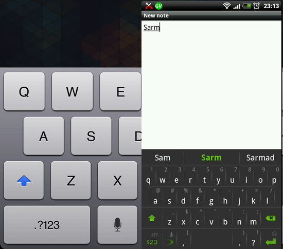
Figure 1: The iPad keyboard alongside the SwiftKey keyboard. Notice that by default, SwiftKey's keys are not in caps. Also note the spelling correction mechanism, similar to one found in default Android ICS.
I do like the ability to split the keyboard in landscape view. It’s great for typing whilst holding the device and walking, or propped up in bed.
You can’t put Newsstand in a folder
I just didn’t like all the apps splayed across the desktop (home screen), so I put them all in a folder. I can put everything inside a folder, expect for Newsstand. I found that to be curious. At first I thought it was because the Newsstand magazines are downloaded from the App Store, so it’s just a specialized folder for magazine type apps. But the Newsstand magazine apps can’t be removed from Newsstand either. So the entire thing is a bit of anomaly.
Twenty to a folder
As I was dumping all my applications in one folder, I hit a limit at 20 apps. I guess it’s limited by the amount of screen space. Would have been nice to not have a limit or an option to disable such limit (Yes, to the curious among you, I was trying to recreate the Android App Drawer). I can see that Apple set it up just so that folks don’t have to scroll at all. Oh well.
Apps get added to second screen
This one actually annoyed me as I downloaded new apps. Although my first screen is almost completely devoid of apps, all new apps are added to the second screen. Why? They should just go to the first open space in the first screen.
No sorting by ratings
I think the App Store as well as Google Play (and amazon.com) could learn a lesson from the fantastic Newegg.com store. You can sort by anything and everything based on specifications. But more to the point, you should be able to sort reviews by ratings, versions, length of ownership, etc. I did like that you can choose to view ratings for the current version and all versions. It’s a step in the right direction.
Back, done, setup, and other navigation cues on top
I’m very fond of the four buttons on an Android device (three persistent buttons on ICS). That’s three extra buttons than an iOS device. I absolutely love the ‘back’ and ‘search’ button. I love the ‘back’ button because it’s always there, and mostly every app uses it properly: you press it and expect to go to the previous screen. Apple alleviated the need for a back button by enforcing good habits in programmers I suppose. In iOS apps, the back button is always found on the top left of an application. I think it works well for a phone, but it’s probably a lot more convenient to have that ‘back’ button on the bottom panel in a large tablet. Regardless of how I held the device, I had to move my hands to the top of the device (and sometimes across the screen) to hit that button. Either by chance or good planning, Android tablets have the ‘back’ button on the bottom, which makes it much more accessible.
I miss the search button as well. I usually just treated the search button as a launcher like Launchy for Windows, or the search field in Windows Start Menu. Everything gets indexed (documents and music as well) so it’s one access button to almost everything. iOS and Android ICS don’t have that search button, which is a bit of a bummer. iOS does have a very good search feature on the left of the home screen, but because of having only one button, accessing it is a two-step affair at a minimum.
The third Android button not found in iOS is the ‘menu’ button. It might have been a good idea when Android started—I liked it initially as well—but really no one knows how to use it so it leads to a very confounding user experience from one app to another. I’m okay with it being removed in Android ICS. iOS apps usually have a settings button on the top bar in an application; just like the back button, it would be nicer for this to be in a panel along the bottom.
You can’t change defaults
I downloaded the browser ‘Dolphin HD’. I wanted it to be default handler for links. There is no system setting to make that happen. It’s another nice feature in Android that I don’t expect Apple to be bring to their platform.
Device name
You can name your iOS device. It shows up on the network. It’s a nice change from the random strings of numbers that an Android devices identify with. As far as I know, I couldn’t even change the device name with Cyanogenmod ROM on my Android phones.
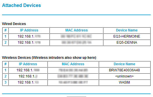
Figure 2: Naming devices! As any self-respecting geek, I name my devices properly. The Android device shows up as <unknown>. The printer shows up as BR...
Multitouch gestures
If there's one thing that PC users are missing out on, it's gestures on Mac OS X. From two finger scrolling to four finger mission control, it's just fantastic. The iPad has the four-fingered gestures for app switching, and it's great. iPhones and Android phones should figure out how to implement it. The Dolphin HD browser has some gestures, and it works well on Android phones, but aren't particularly convenient on the iPad (Probably because the gesture button is not towards the bottom, unlike the placement in Android phones). I think gestures in general would be a great boost to any platform, let alone four, or five-fingered gestures.
Battery life
It’s great. For the first few days I didn’t have too much time to play with the device (work!) but after four—four—days the battery life was at 30%. Yes it was basically standby, but good luck getting a Windows PC last on instant-on standby for four days with still plenty of battery to spare. Just great.
That’s it as far as first impressions are concerned. There’s obviously more to talk about, the fancy display, the apps, the syncing… I plan to talk about all those things in greater detail one I’m more familiar with the device and place it somewhere in my workflow.